Seattle Storm will defend 4th WNBA title with a new logo and look
Mar 2, 2021, 11:16 AM | Updated: 12:27 pm
The new Seattle Storm logo takes inspiration from around the northwest. (Seattle Storm)
(Seattle Storm)

The Seattle Storm are making a lot of changes for the 2021 WNBA season, and that’s not limited to the team’s roster.
The four-time WNBA champion unveiled a brand new logo Tuesday morning as it launches a new “brand identity,” which coincidentally comes as the team has undergone a pretty significant change to its roster this offseason.
💎⚡The weather-hardened crown jewel of the Pacific Northwest.⚡💎#TakeCover⚡ pic.twitter.com/mlWejjEU44
— Seattle Storm (@seattlestorm) March 2, 2021
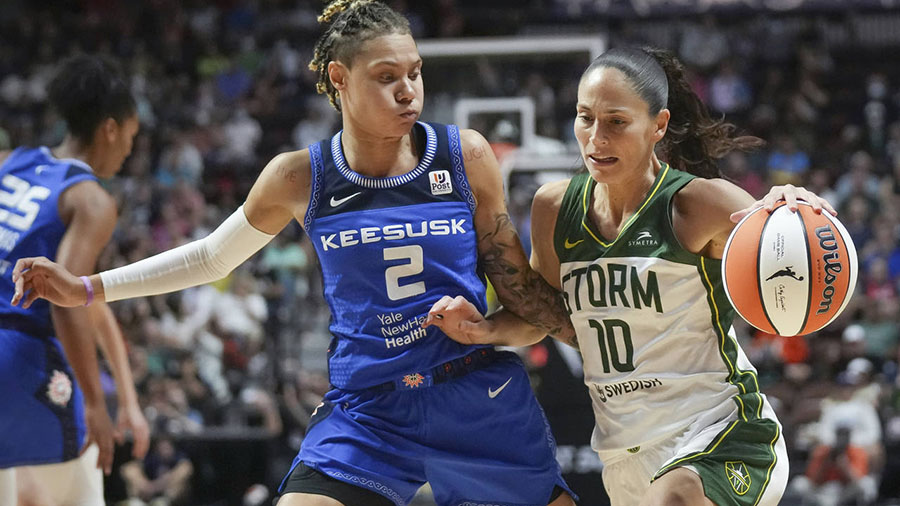
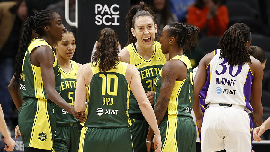
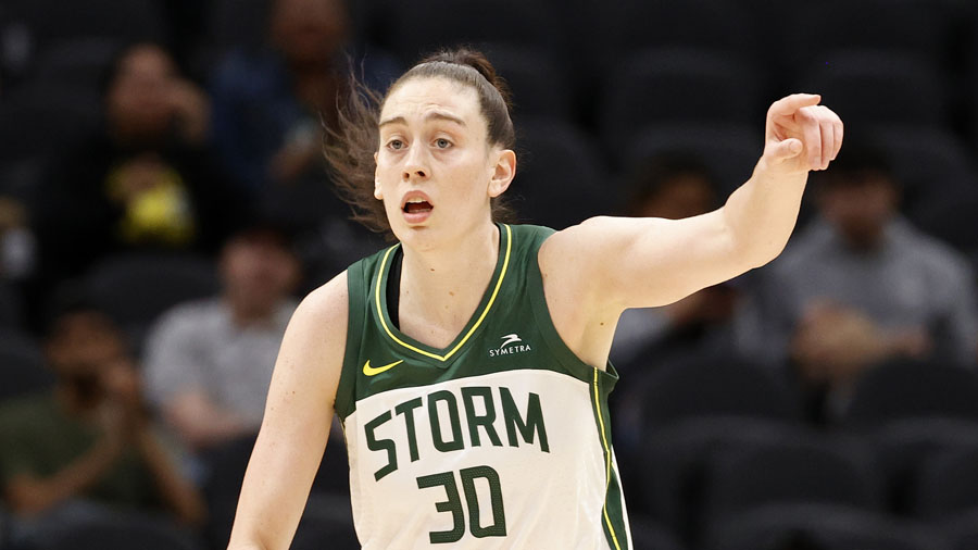
While reigning WNBA Finals MVP Breanna Stewart isn’t going anywhere and the legendary Sue Bird has inked a deal to return for her 20th season with the Storm, Seattle is moving on without All-Star forward Natasha Howard and guard Sami Whitcomb, who were both traded to the New York Liberty, and Crystal Langhorne, who recently retired. The Storm have also added a number of new faces, including All-Star Candice Dupree and 2019 first-round pick Katie Lou Samuelsen.
The Storm’s new and returning players will defend their WNBA title in 2021 featuring a different look that is built around a logo that reflects “the storied history of the franchise, its championship culture and connection to the city of Seattle and the Pacific Northwest,” the team said in a press release Tuesday.
⛈️ A force to be reckoned with.⛈️#TakeCover⚡ pic.twitter.com/qf5r237d70
— Seattle Storm (@seattlestorm) March 2, 2021
The Storm’s new logo keeps Seattle’s Space Needle as a feature but adds inspiration from Mount Rainier for its shape.
“The new logo retains the iconic image of the Space Needle, which sits within basketball ribs. Overlooking it all is the peak of Mount Rainier, representing Seattle’s home in the Pacific Northwest. At the center, a lightning bolt evokes the intensity, power, and purpose of the Storm identity both on and off the court,” the press release reads. “The logo’s combined elements bring together both the sleek, innovative aesthetic of Seattle with the natural power in the surrounding Pacific Northwest. The new wordmark uses a more futuristic typeface to better represent the fast-paced and forward-moving city the Storm calls home.”
The Storm also are maintaining their primary colors, with a few subtle changes: Lightning Yellow, a deep Thunder Green, and a brighter Bolt Green.
Hoops is in our blood. Always has been, always will be. 🏀😤#TakeCover⚡ pic.twitter.com/SUBvrZi1wZ
— Seattle Storm (@seattlestorm) March 2, 2021
The new logo will fly atop the Space Needle on a flag that will be raised at 2 p.m. Wednesday by Bird and fellow guard Jordin Canada.